(Q) Let’s start with your name, your company, and your room. Tell us a little bit about yourself and your interests.
A: Kips Bay is a bit of a vetting process for me. This is something that a lot of designers strive towards, a lot of designers apply to this year after year so to get in and to be considered is awesome, but to be chosen, it's just very prestigious for us to be seen as a voice in our industry. It means a lot. It is kind of a stamp of approval that your voice matters, that what you design and what you decide to do is something that people are watching and it's something that I look forward to just creating.
(Q) Tell us about your room and the inspiration behind the design?
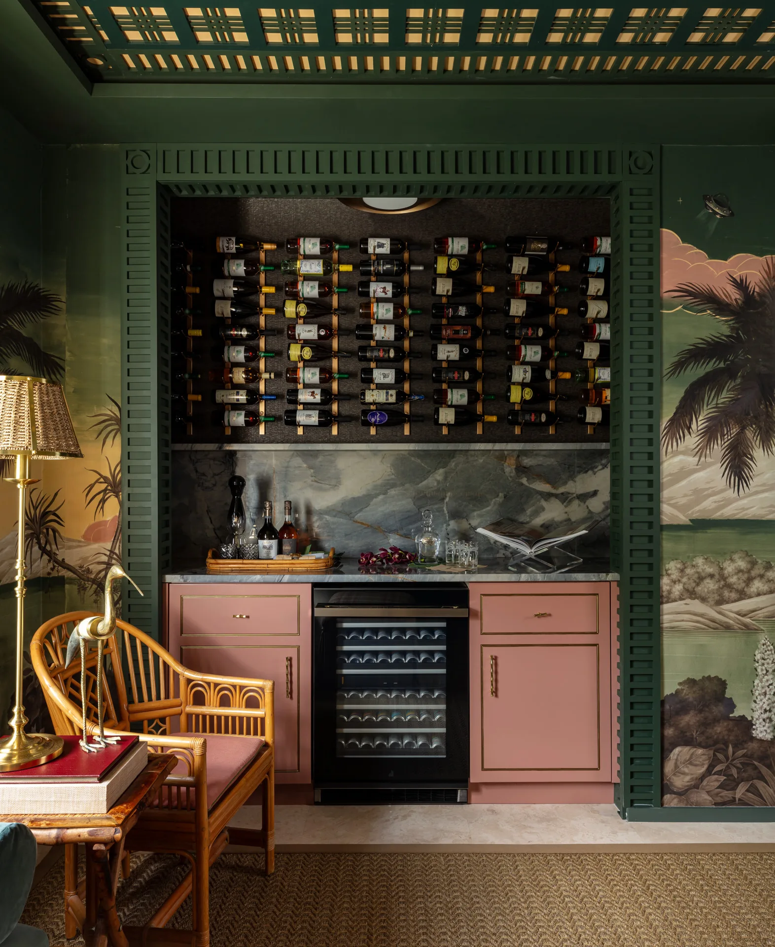
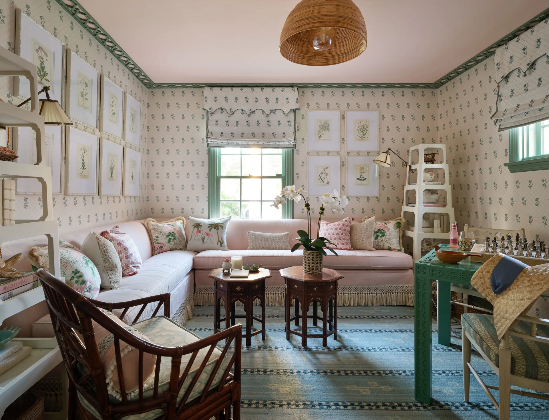
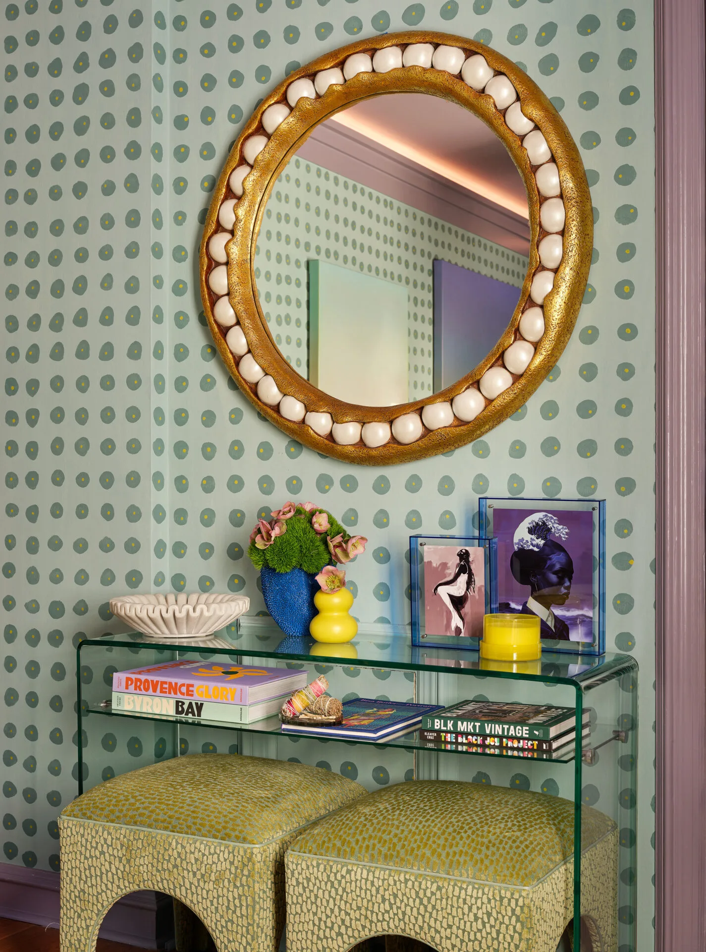
A: The goal was to design a space that looks and feels a little bit like Palm Beach, which is classic green and pink, but I wanted to do our own take on it. Instead of doing the standard colors, we wanted to go a bit more obscure with a dark forest green, blushy salmon, and marigold yellow so you'll see that throughout the room. From there, we just kind of built a palette on top of that.
The most important factor for us is usually creating an immersive space. We don't want anything to just be. The highlight is creating an experience for everyone. Coming into the room, you feel engulfed. You feel like you're dragged into the space, you're held there and you're creating moments for yourself.
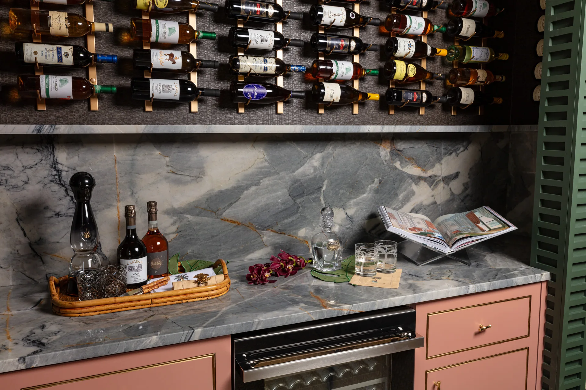
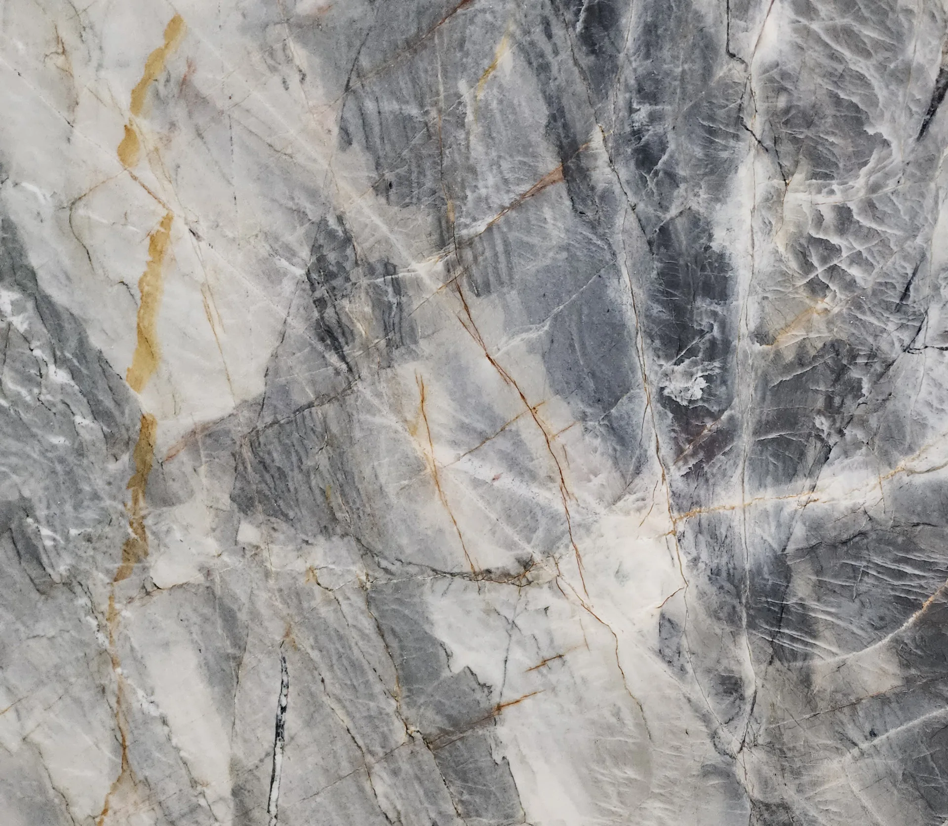
Ijen Blue Quartzite Bar
A: The goal was to design a space that looks and feels a little bit like Palm Beach, which is classic green and pink, but I wanted to do our own take on it. Instead of doing the standard colors, we wanted to go a bit more obscure with a dark forest green, blushy salmon, and marigold yellow so you'll see that throughout the room. From there, we just kind of built a palette on top of that.
The most important factor for us is usually creating an immersive space. We don't want anything to just be. The highlight is creating an experience for everyone. Coming into the room, you feel engulfed. You feel like you're dragged into the space, you're held there and you're creating moments for yourself.
(Q) What kind of vibe and aesthetic were you aiming to achieve in the project?
A: Our setting and vibe for this particular space is isolation and solitude. As you look around the room in our wallpaper, it's a sunset. On one side of the room, it's a little bit lighter, and on the other side, it's a little darker. This is supposed to kind of create an adventurous space of just exploration, but internally and within yourself. It's a space to sit, have your tea, have a glass of wine and just be a bit more introspective.
A: Our setting and vibe for this particular space is isolation and solitude. As you look around the room in our wallpaper, it's a sunset. On one side of the room, it's a little bit lighter, and on the other side, it's a little darker. This is supposed to kind of create an adventurous space of just exploration, but internally and within yourself. It's a space to sit, have your tea, have a glass of wine and just be a bit more introspective.
(Q) What did the stone help you accomplish in your overall design? What drew you to the stone you selected?
A: During the exploration of the concept, Primestones helped me create a more natural tone and a feel that I was looking for. With all the pieces of furniture and all the paper, everything is manufactured, but to have a natural piece and a natural element brings a timeless and classic feel to the space.
The stone that we selected was Ijen Blue Quartzite and so this spoke to me very quickly because although our design palette is green, blush, and marigold, we have a banquette that has more of a teal kind of turquoise green base color to it that I wanted to replicate on the other side of the room. Ijen Blue anchors one side while the banquette holds down the other.


