Ruben & Katie Gutierrez
(Q) Tell us a little bit about yourself and your interests
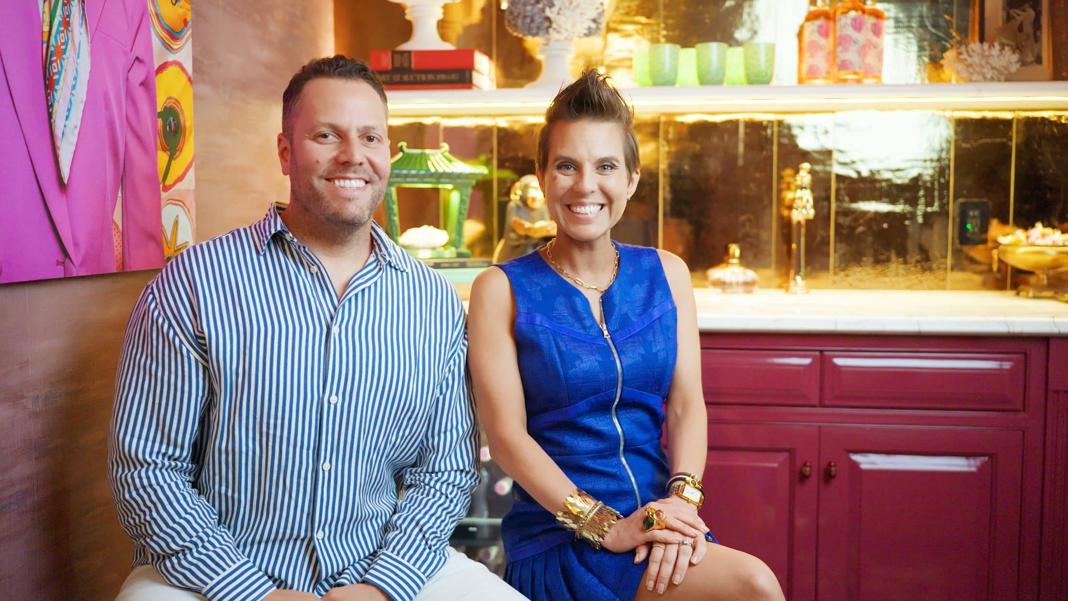
A: So Ruben and I first started life as architects and in working with architecture and designing, like roof details and this kind of stuff, we didn't feel like we were able to influence the person who lives inside of the space as much as we felt our hearts really had desire to. So we sort of jumped ship into interior design and our real huge passion to work with an individual really blossomed into our design philosophy that we now call biographical design. Biographical design is a design philosophy and signature system wherein we uncover six key points along a person's biography and use that as the foundation to the way that we design space, so that the space is a vehicle of their self-expression, because self-expression is really the root of fascination.
A: So Ruben and I first started life as architects and in working with architecture and designing, like roof details and this kind of stuff, we didn't feel like we were able to influence the person who lives inside of the space as much as we felt our hearts really had desire to. So we sort of jumped ship into interior design and our real huge passion to work with an individual really blossomed into our design philosophy that we now call biographical design. Biographical design is a design philosophy and signature system wherein we uncover six key points along a person's biography and use that as the foundation to the way that we design space, so that the space is a vehicle of their self-expression, because self-expression is really the root of fascination.
(Q) What does Kips Bay mean to you? What does it mean to be a designer for this showhouse?
A: First and foremost, we're drawn to this because of all the great work that Kips Bay does with the Boys and Girls Club. But beyond that, we are just honored to be included with all these great designers to be able to put our mark on the space. We really wanted visitors to be inspired to think of design in new ways and to learn about biographical design and how that can create their homes.
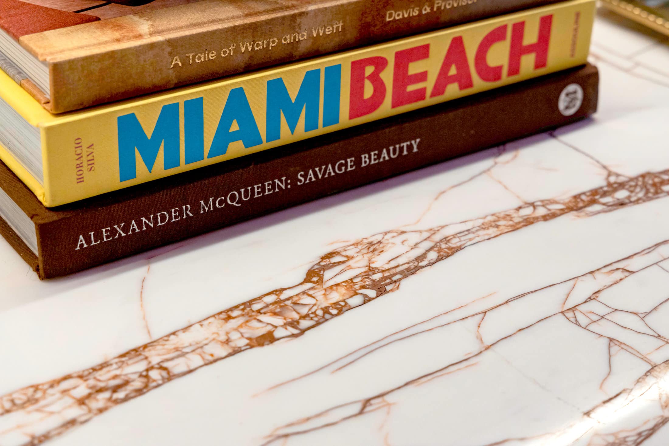
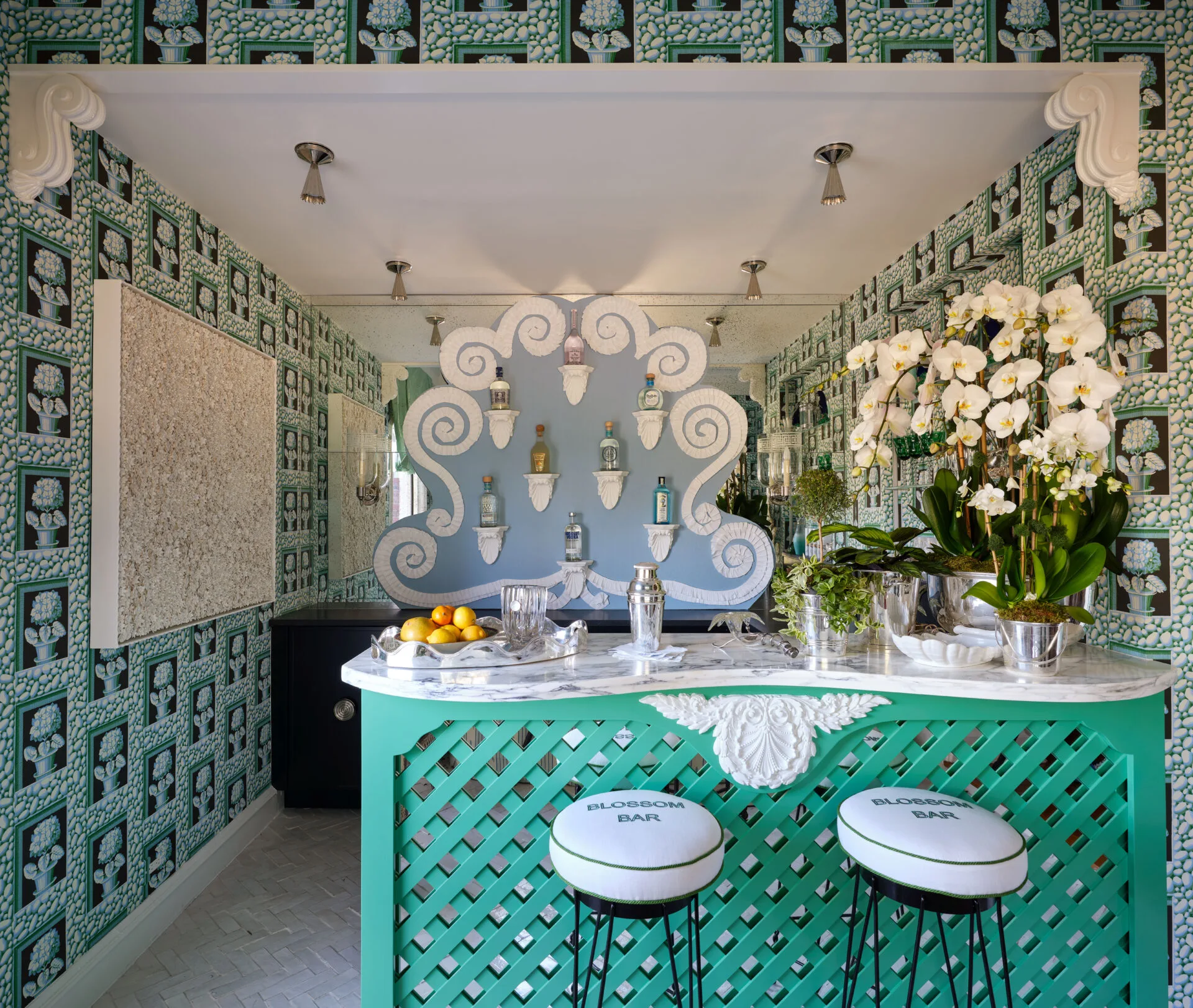
Rosso Venato Dolomite Bar
A: First and foremost, we're drawn to this because of all the great work that Kips Bay does with the Boys and Girls Club. But beyond that, we are just honored to be included with all these great designers to be able to put our mark on the space. We really wanted visitors to be inspired to think of design in new ways and to learn about biographical design and how that can create their homes.
(Q) Tell us about your room and the inspiration behind the design?
A: We designed this space using our biographical design method. And the first thing we do is understand the biography of our client. In this particular case, we used Henry Flagler as our inspiration. We considered a modern day Henry Flagler using this home to entertain guests, kind of borrowing from his hotelier industrialist background to create a welcoming spot for his guests to arrive. We used that as a jumping off point to create every detail, each element that we put in this room, the color scheme, the pieces in it all kind of tie into that larger story that we're trying to tell.
A: We designed this space using our biographical design method. And the first thing we do is understand the biography of our client. In this particular case, we used Henry Flagler as our inspiration. We considered a modern day Henry Flagler using this home to entertain guests, kind of borrowing from his hotelier industrialist background to create a welcoming spot for his guests to arrive. We used that as a jumping off point to create every detail, each element that we put in this room, the color scheme, the pieces in it all kind of tie into that larger story that we're trying to tell.
(Q) When designing this room, what was the most important factor for you?
A: So the most important factor for us when we were designing this room was to really create a mood and a feeling. All the elements of the room had to kind of tie in to that overall feeling. We wanted someone to walk in here and feel like a hug, welcoming. You're here. You can take your shoes off, have a drink, relax and that was really what we strived for. It came from imagining that Henry Flagler owns this house and he's receiving a guest that has traveled a very, very long journey to have arrived. We knew we wanted to create a space that felt really warm, really cozy for somebody who has traveled.
A: So the most important factor for us when we were designing this room was to really create a mood and a feeling. All the elements of the room had to kind of tie in to that overall feeling. We wanted someone to walk in here and feel like a hug, welcoming. You're here. You can take your shoes off, have a drink, relax and that was really what we strived for. It came from imagining that Henry Flagler owns this house and he's receiving a guest that has traveled a very, very long journey to have arrived. We knew we wanted to create a space that felt really warm, really cozy for somebody who has traveled.
(Q) What did the stone help you accomplish in your overall design? What drew you to the stone you selected?
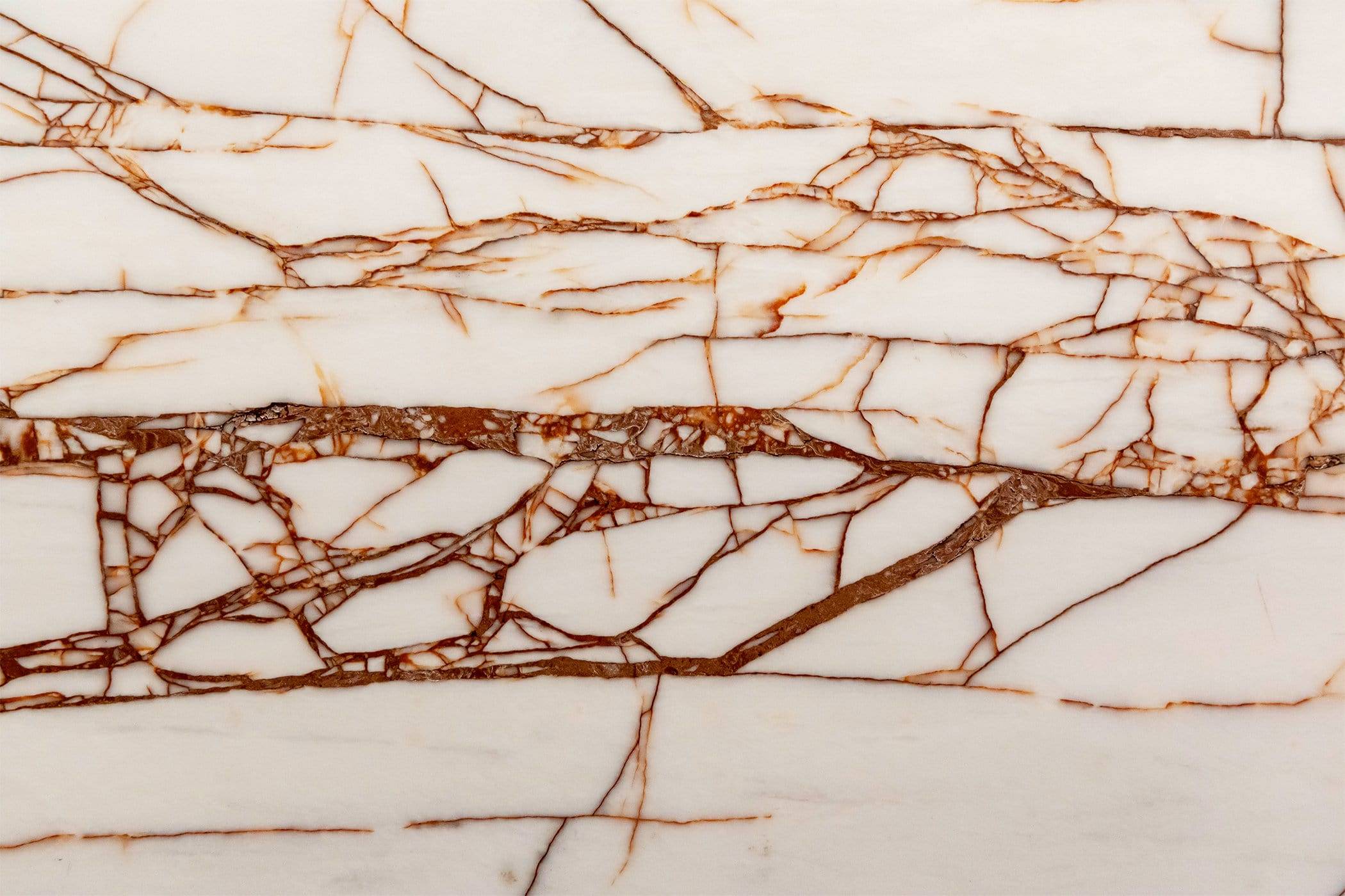
A: So it was so important that every single element in this room worked in concert with the overall concept that we had. What we loved about working with Primestones is that there were so many options that we were able to get the exact one that fit exactly what we were looking for. So when we selected the Rosso Venato Dolomite, what we found was that it had this white bright background to it and had the veining in the colors that were exactly perfect to fit in concert with the whole of the space.
Rosso Venato Dolomite Closeup
A: So it was so important that every single element in this room worked in concert with the overall concept that we had. What we loved about working with Primestones is that there were so many options that we were able to get the exact one that fit exactly what we were looking for. So when we selected the Rosso Venato Dolomite, what we found was that it had this white bright background to it and had the veining in the colors that were exactly perfect to fit in concert with the whole of the space.
(Q) Were there any hurdles that you had to overcome in the overall scheme of the design process?
A: Everything had to happen like clockwork and Primestones came through exactly when we needed them to in order for everything to be seamless. We also had some really complicated things that we were doing. For example, the shelf that's made out of the same material as the countertop and has lighting installed and everything, and it was just the perfect product to receive the functionalities and the structural elements and everything we needed to make that happen.
(Q) Were there any pleasant surprises along the way?
A: One unique thing about this project was that we had to work digitally with Primestones, so they sent us high quality images so that we could make our selection over the computer, which is unusual for us. It really worked because our images were true to color and they had photographs of the entire slab, and it made us really confident in the decision we made. It just made the whole process really easy. We used the live inventory aspect of their website so that we can kind of shuffle through the larger supply that they had and pinpoint the ones that we could actually use.


