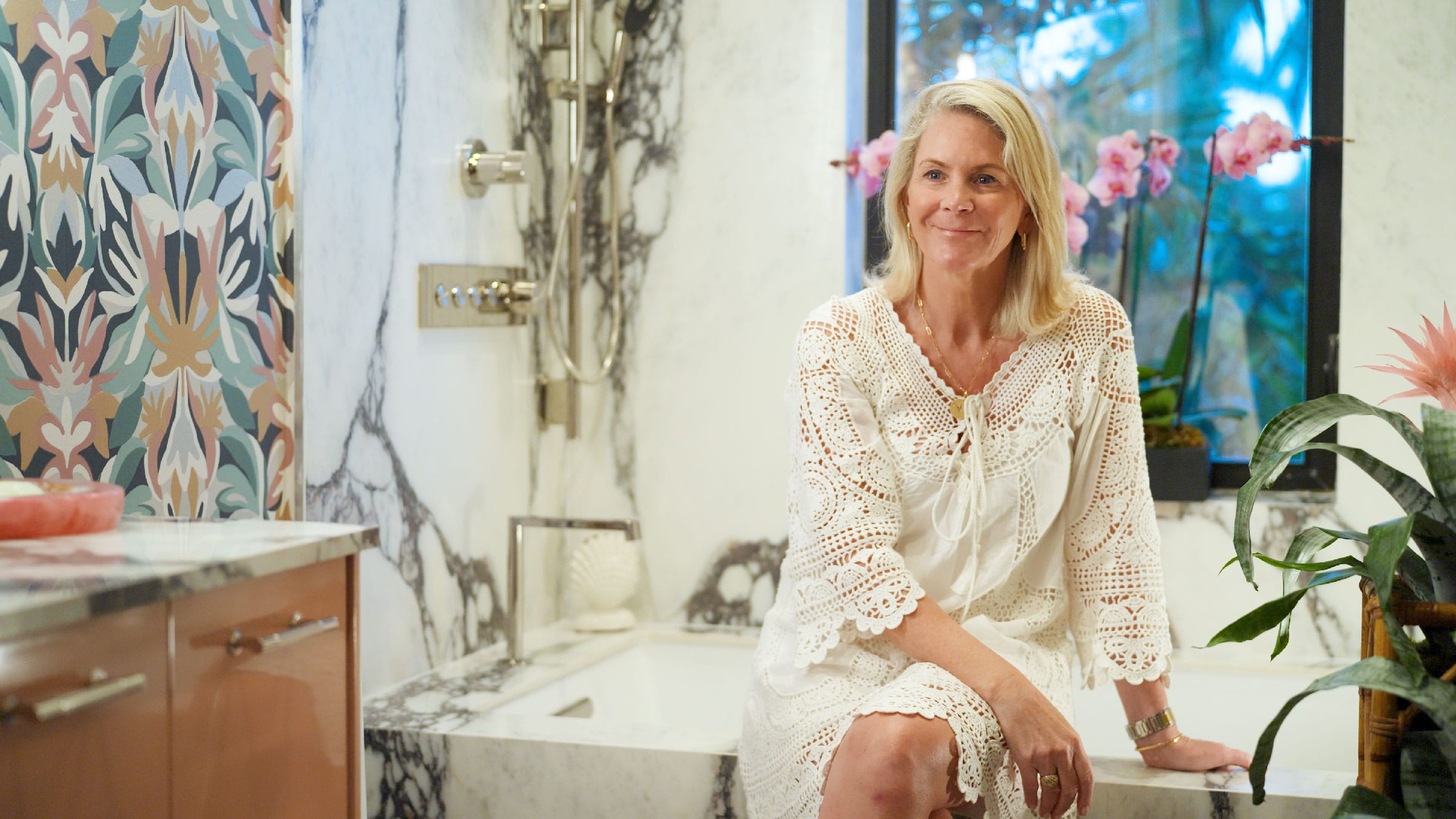
(Q) Tell us a little bit about your company, a little about yourself and the room you have for the show house
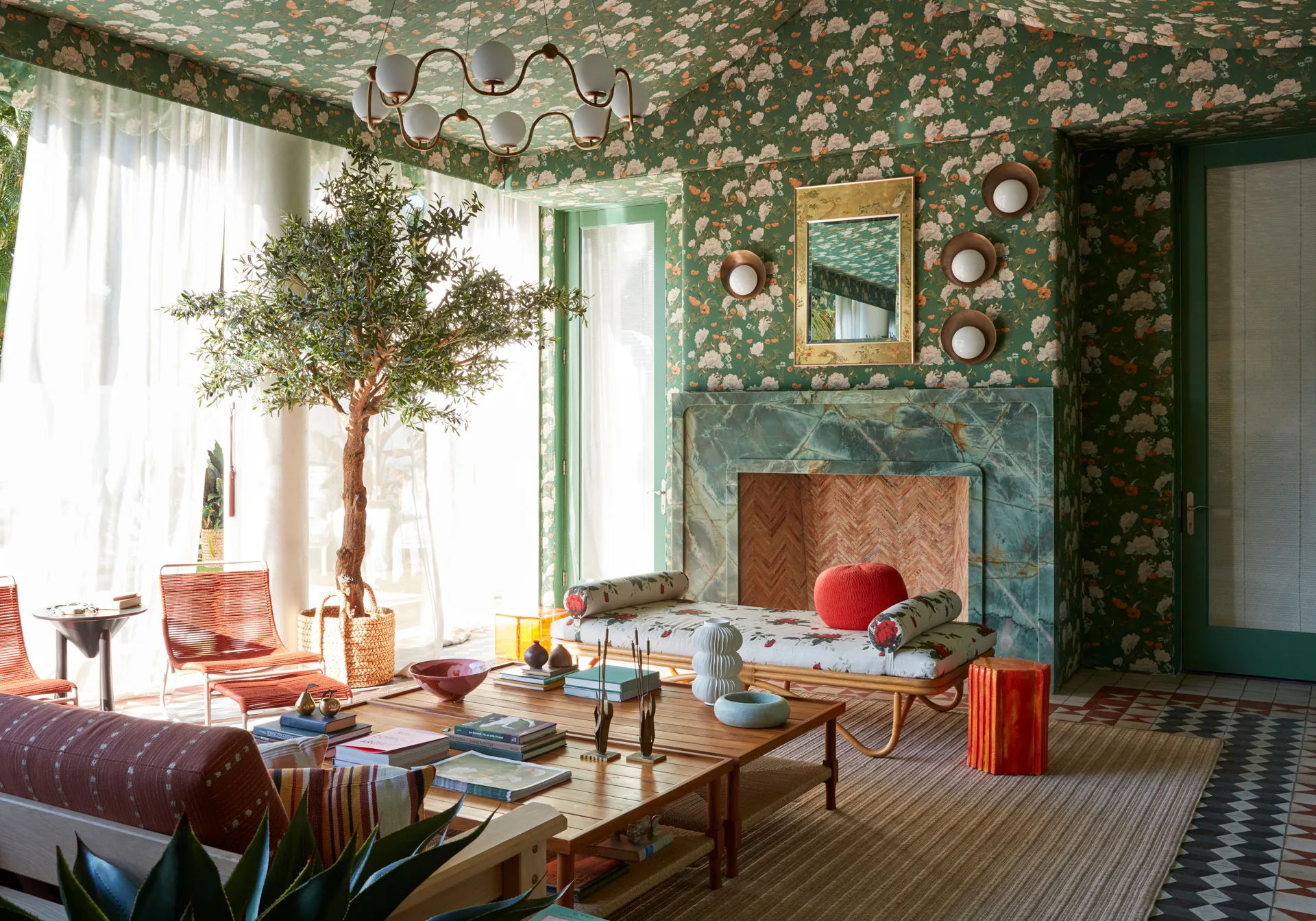
A: We’re based out of Watermill, New York and New York and Palm Beach. The name of our room is Welcome to the Jungle. As you can see, we have lots of tropical touches, some interesting graphic wallpapers that give you the feel that you are in a wild jungle. I think it was really destiny. When I was a kid, I was always rearranging my mother’s bookshelves and fluffing the pillows, and I’m not sure why I took such an interest in it, but it’s definitely been in my DNA since I was young. When I met my husband, we partnered together to do the business. He was in advertising and we have grown our business together over the past 20 years.
(Q) What does Kips Bay mean to you? What does it mean to be a designer for this showhouse?
A: Being from New York, the charity is based in New York City. It’s for the Boys and Girls Club. It’s based in New York City. This is an amazing charity. So anything that is surrounding Kips Bay, it feels good, you’re giving back. You’re also doing something at a very high level. Kips Bay is like the Super Bowl of show houses, so not only do we feel honored to be part of it, when you think about all the good that’s coming out of it, it’s a win-win.
(Q) Tell us about your room and the inspiration behind the design?
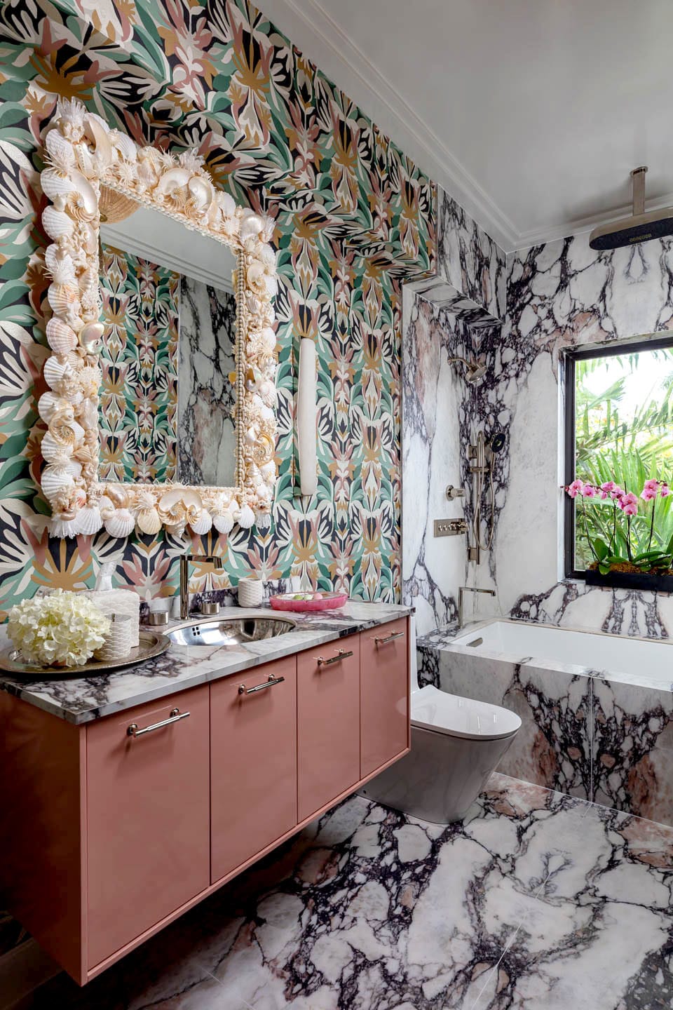
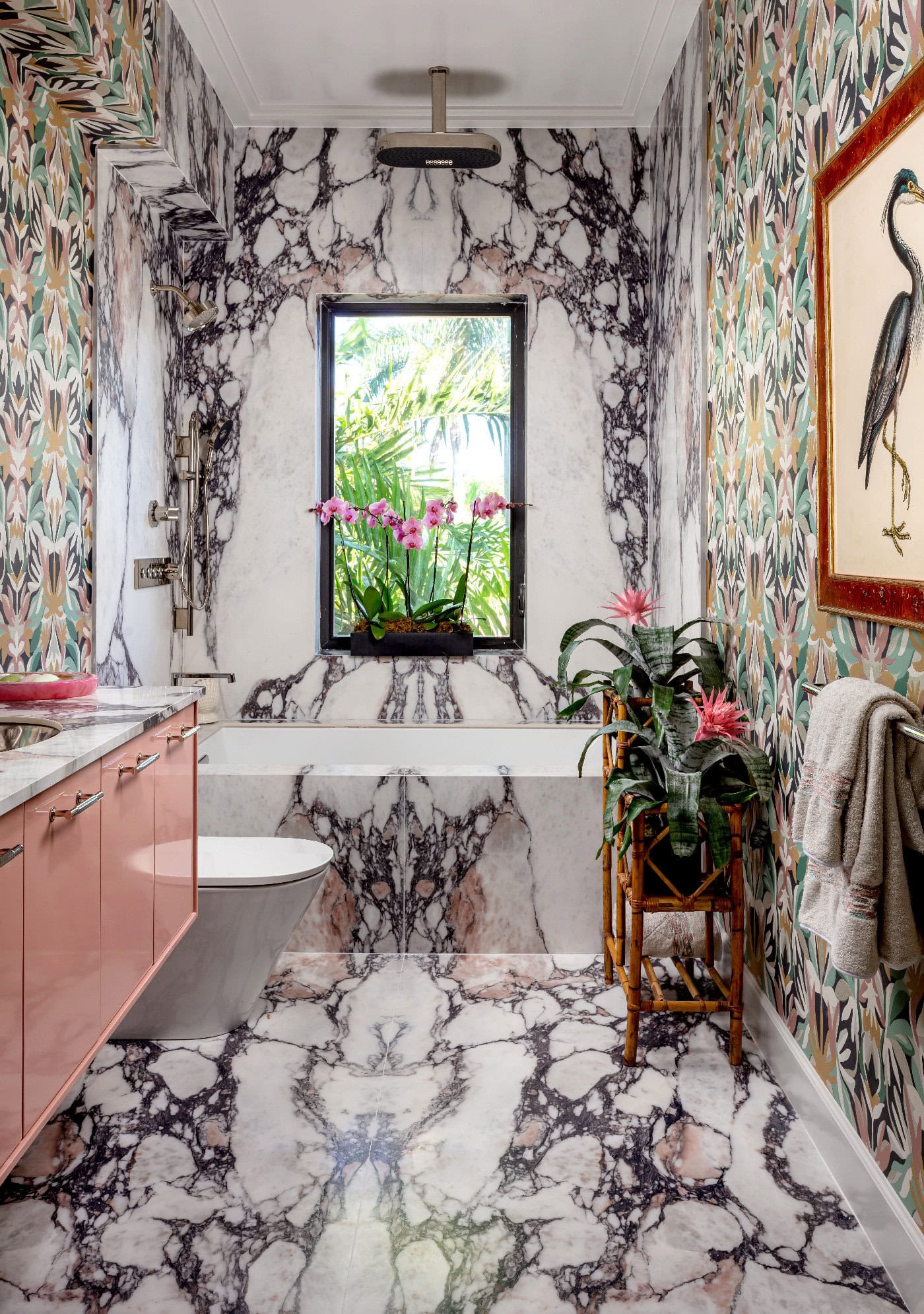
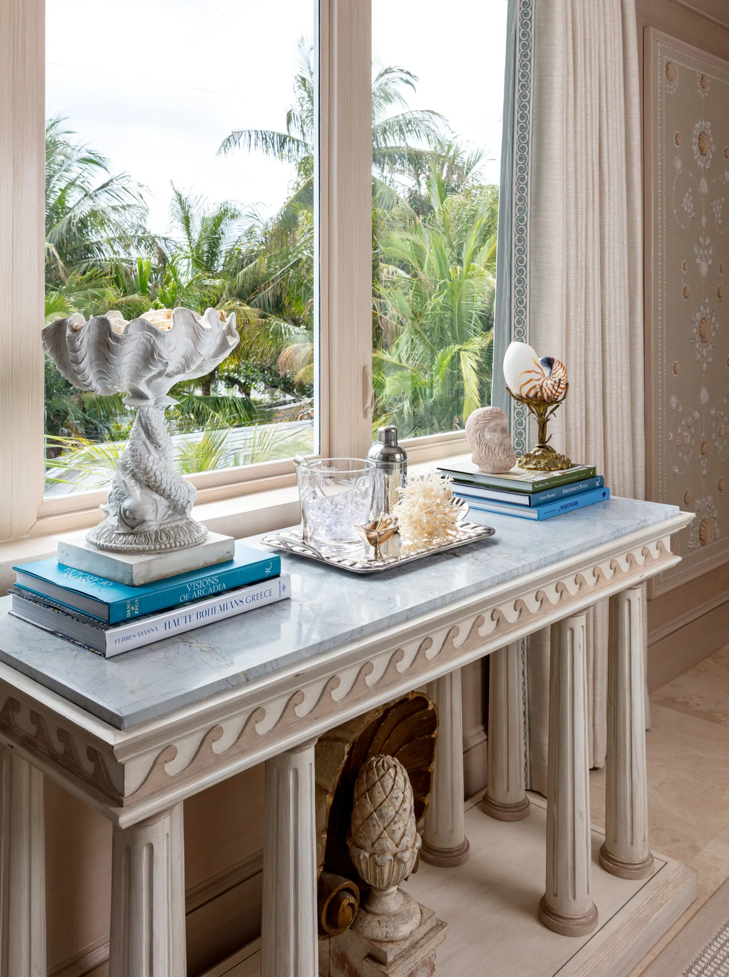
A: We wanted to bring a little bit of classic Palm Beach meeting, sort of a modern day Palm Beach. Some of the beginning factors were the wallpaper we have in the main bedroom, and the stone selection for the bath surrounding floor. So there was sort of a foundation we were looking for to build off of.
(Q) When designing this room, what was the most important factor for you?
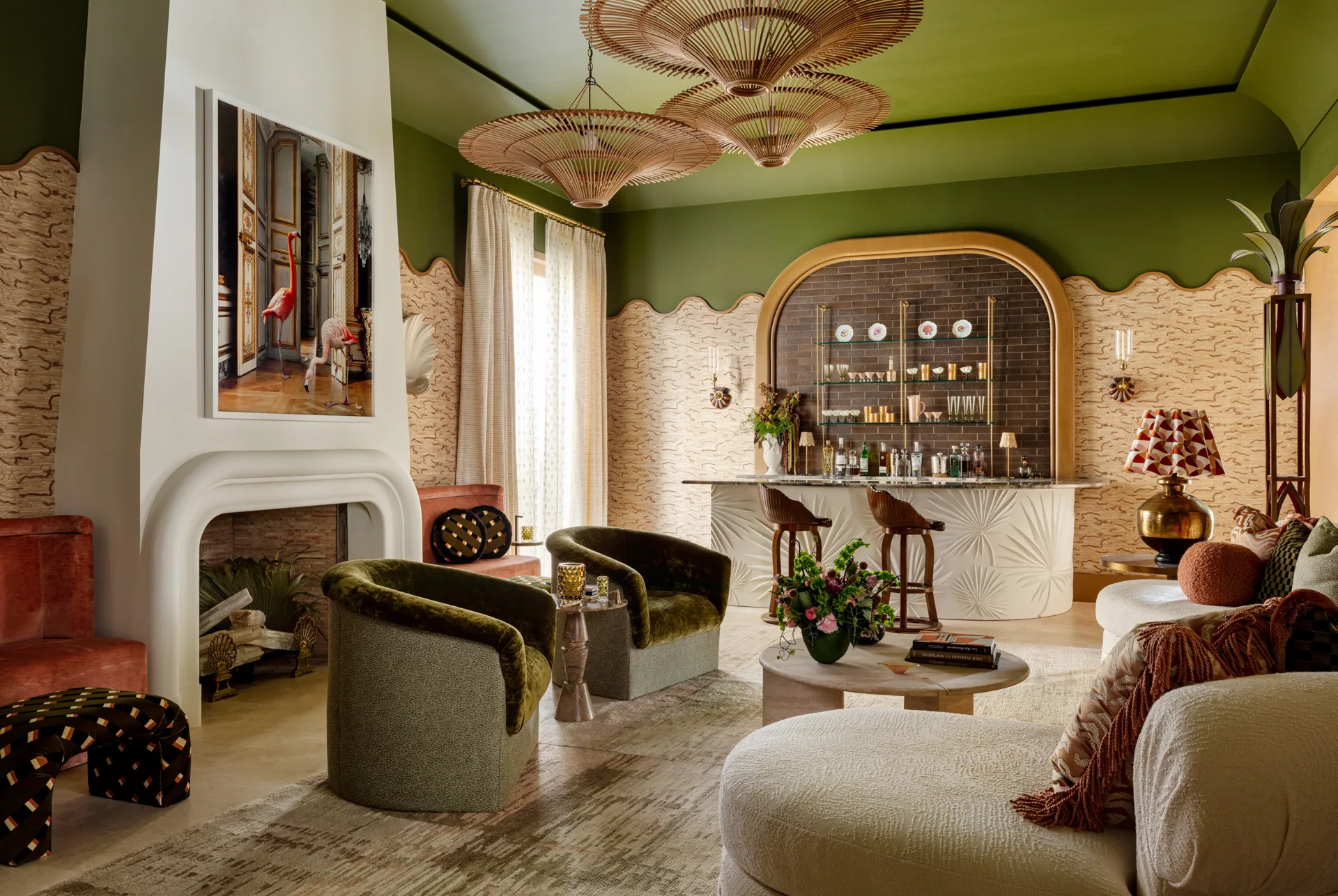
A: The most important factor of putting together these rooms we had. First of all, we had three spaces, so we’re thinking about three different things. A bathroom, a bedroom, a closet. We wanted the viewer to come in and see Florida through our eyes and what it could be to live in southern Florida today with a nod to the past, but also understanding people’s attraction to more modern lighting and furniture.
(Q) Were there any particular points that you want to highlight from the process that was a nice surprise for you? Any hurdles you had to overcome?
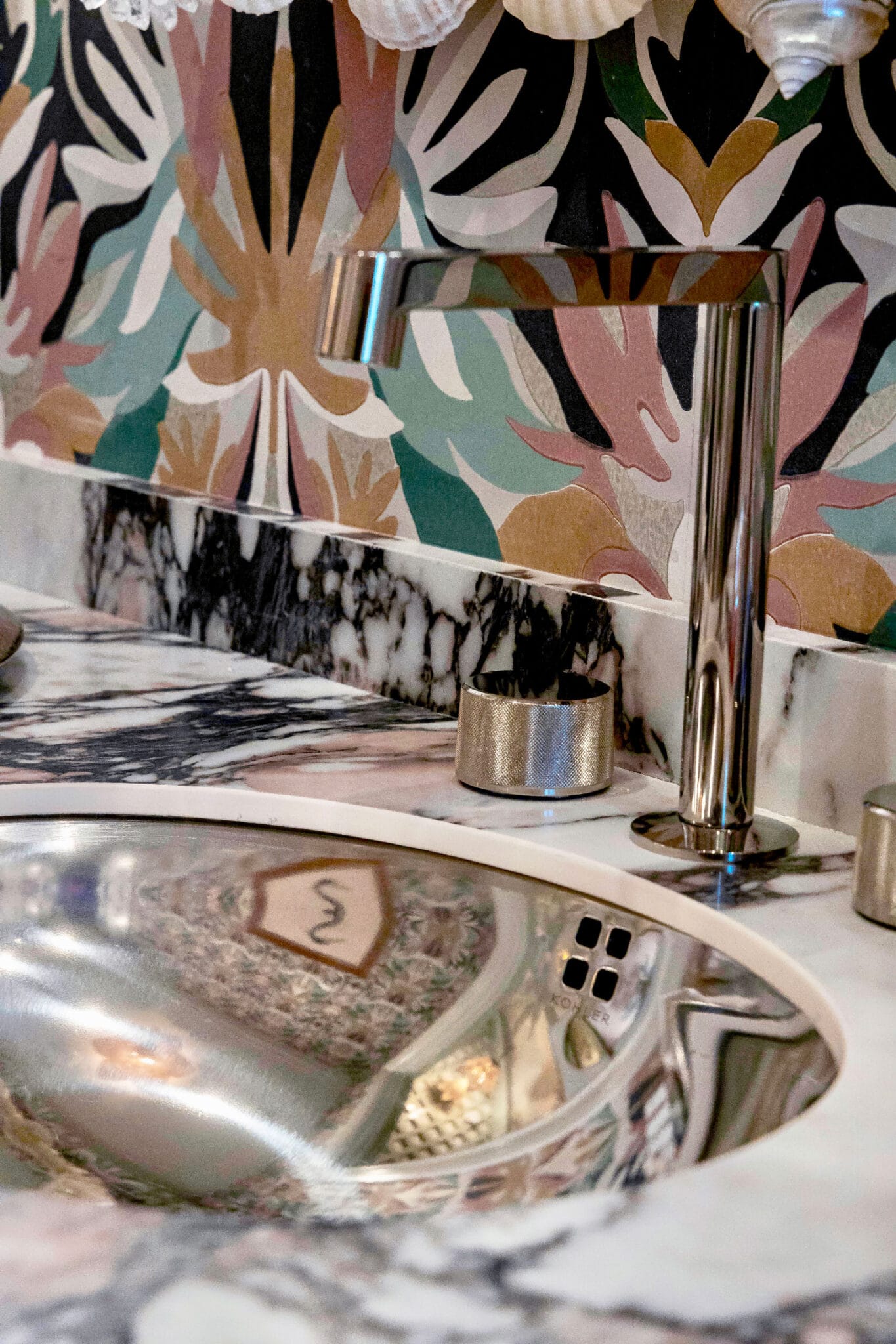
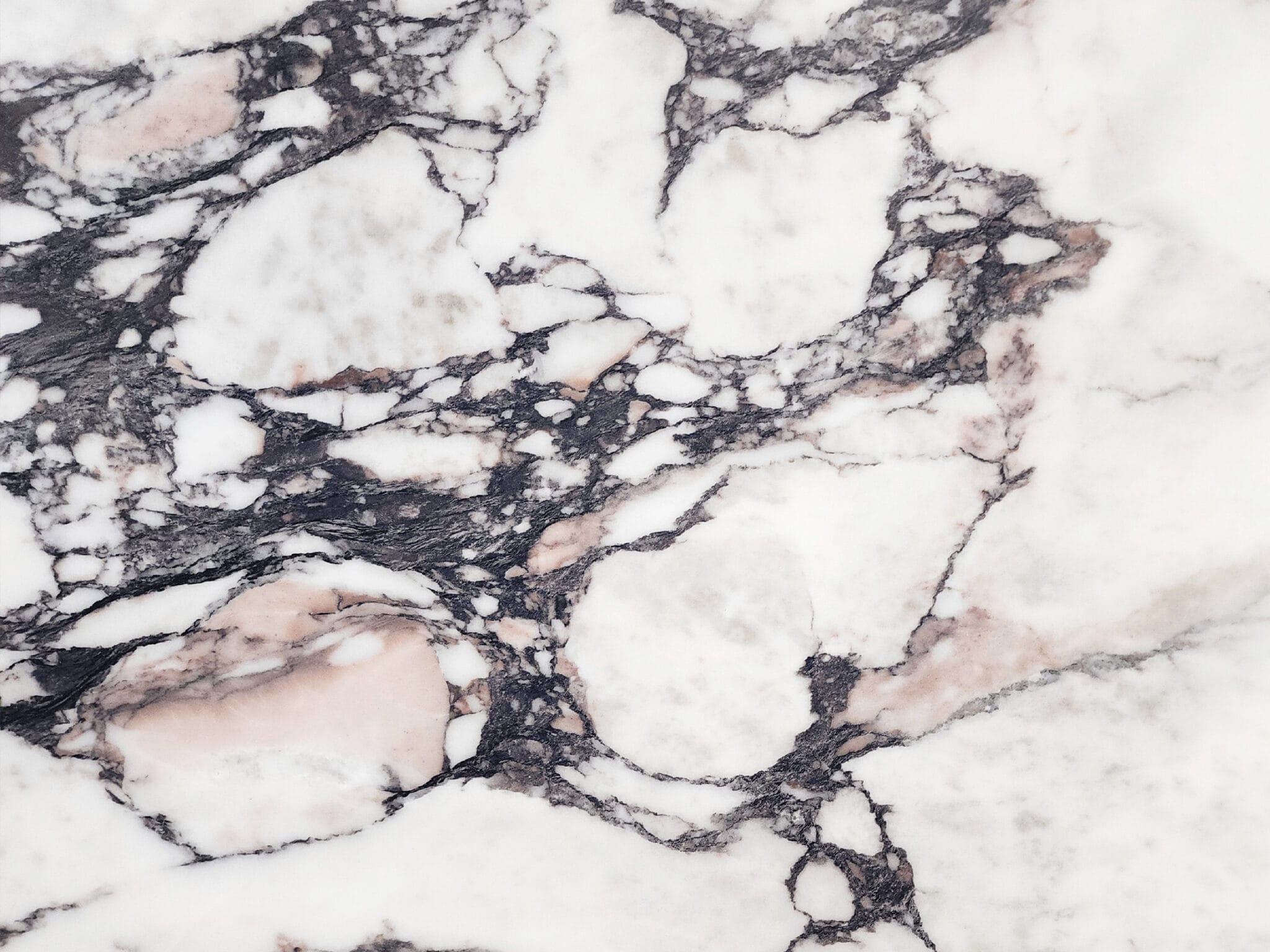
A: You know, I think that’s what we wanted to do is we didn’t want to introduce tile. We wanted to use full slabs. So in our installation we were able to obtain multiple slabs from Primestones, which was so generous because it really got the look. We were able to bookmatch all of the slabs to give everybody the concept. We hope that people will go there now and say, I love what they did. I want to do exactly what we saw. So hopefully we inspired some people and we just are very open to porcelain. It’s an innovative product. It looks like nobody will know that it’s porcelain. So it’s something that we wanted to be a speaking point because it doesn’t have to be real stone This is so beautiful and it looks like honed marble and the price point was great. I think people will be surprised.
