Lindley Arthur
(Q) Let’s start with your name, your company, and your room. Tell us a little bit about yourself and your interests.
A: I'm Lindley Arthur with Lindley Arthur Interiors. We're based in Dallas, Texas and this is the powder bath, which we have named Pristine Providence. I am a residential interior designer based in Dallas, Texas. I actually had sort of an interesting road into interior design. I went to school for public relations and worked for about a decade in the fashion industry, in PR, and just sort of organically grew my interior design business. When I came home to take care of my boys, I think it was just always probably in me. I was always rearranging my room as a little girl and grass cloth, my first cube at my first public relations job. But my parents really wanted me to have a business background, but I love that the public relations background has given me so many skills that I use every day in interior design.
A: I'm Lindley Arthur with Lindley Arthur Interiors. We're based in Dallas, Texas and this is the powder bath, which we have named Pristine Providence. I am a residential interior designer based in Dallas, Texas. I actually had sort of an interesting road into interior design. I went to school for public relations and worked for about a decade in the fashion industry, in PR, and just sort of organically grew my interior design business. When I came home to take care of my boys, I think it was just always probably in me. I was always rearranging my room as a little girl and grass cloth, my first cube at my first public relations job. But my parents really wanted me to have a business background, but I love that the public relations background has given me so many skills that I use every day in interior design.
(Q) What does Kips Bay mean to you? What does it mean to be a designer for this showhouse?
A: Kips Bay is known in the interior design community as one of the best fundraisers and charitable events an interior designer can be a part of. Service is important to my heart, so I obviously want to be a part of anything that serves others and that's always the number one reason. But it's also a fabulous challenge. It's a short time frame, a lot of creative freedoms that go into getting design for a show house. So we were excited about the challenge.
Mystery White Marble Vanity
A: Kips Bay is known in the interior design community as one of the best fundraisers and charitable events an interior designer can be a part of. Service is important to my heart, so I obviously want to be a part of anything that serves others and that's always the number one reason. But it's also a fabulous challenge. It's a short time frame, a lot of creative freedoms that go into getting design for a show house. So we were excited about the challenge.
(Q) Tell us about your room and the inspiration behind the design?
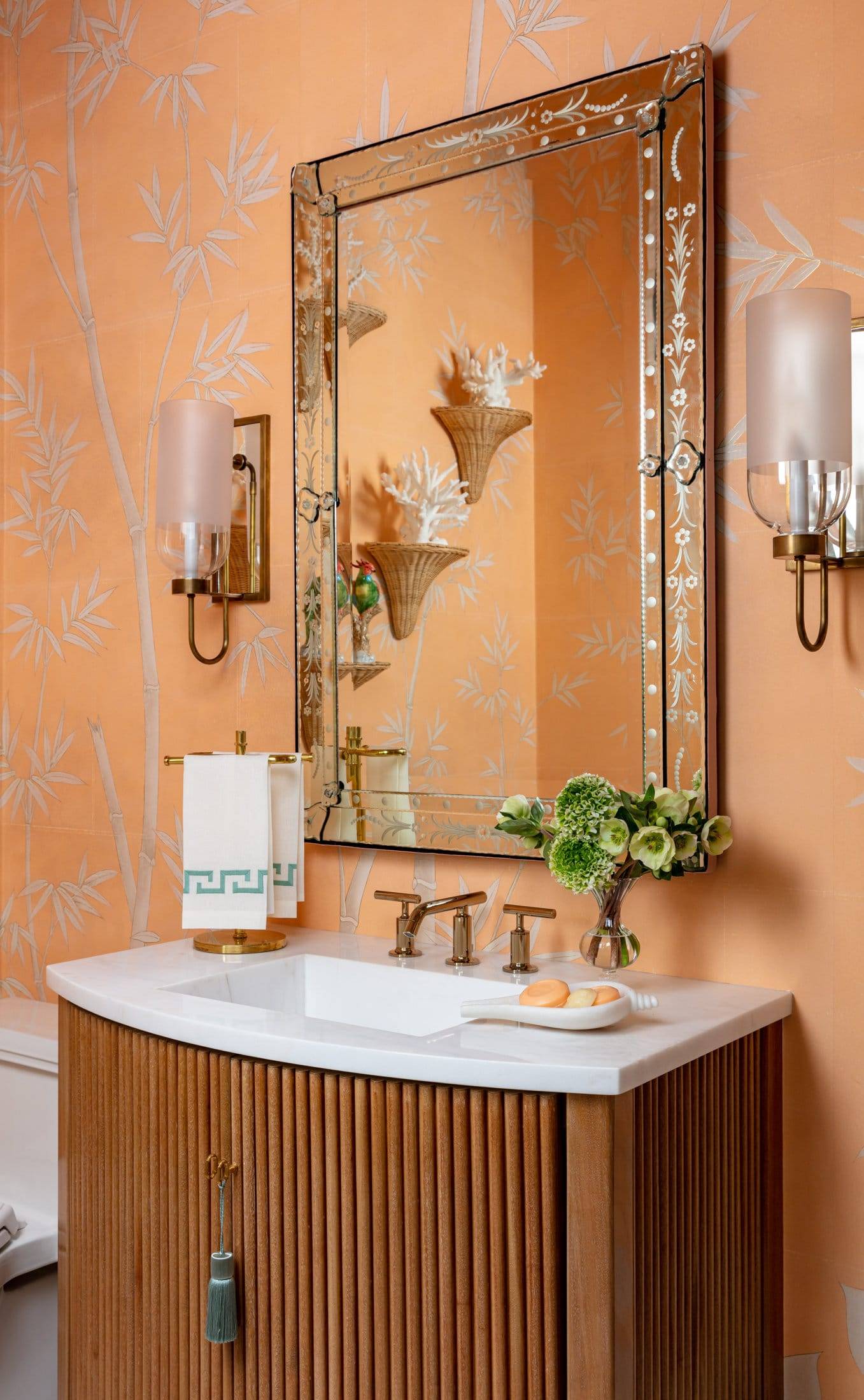
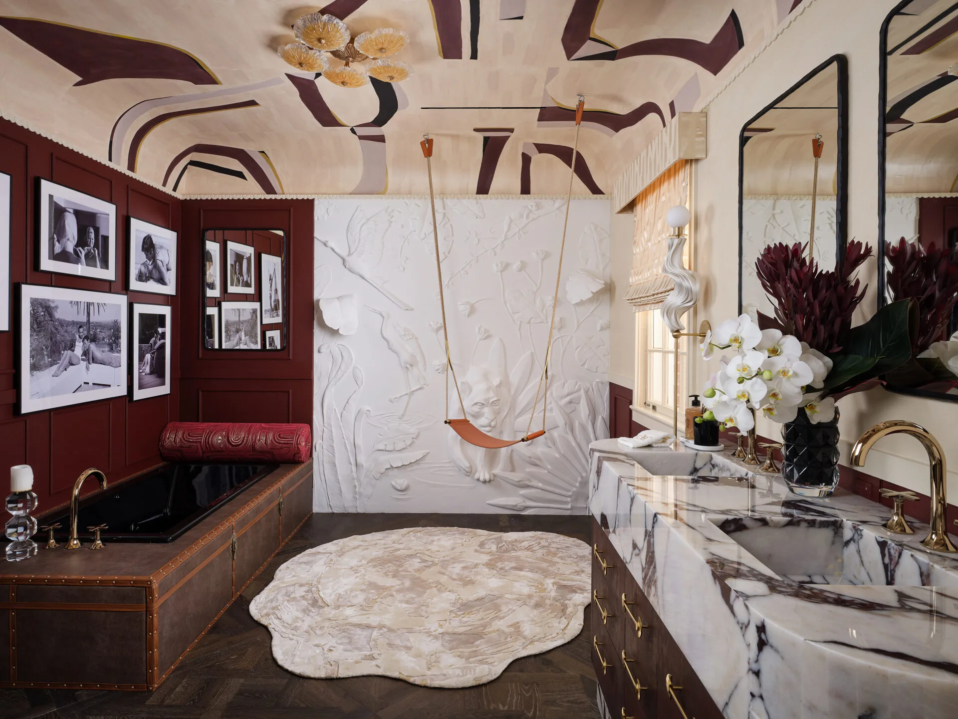
A: We were assigned the powder bath, which we were so excited about because I believe the powder bath should feel not just like a utilitarian space, but as an extension of the home. It should have furnishings, it should have art, and it should feel like a welcoming space in a home. We designed our powder bath inspired by the Lyford Resort in the Bahamas, and we really wanted to design a glamorous, elegant retreat that was timeless and sophisticated.
A: We were assigned the powder bath, which we were so excited about because I believe the powder bath should feel not just like a utilitarian space, but as an extension of the home. It should have furnishings, it should have art, and it should feel like a welcoming space in a home. We designed our powder bath inspired by the Lyford Resort in the Bahamas, and we really wanted to design a glamorous, elegant retreat that was timeless and sophisticated.
(Q) When designing this room, what was the most important factor for you?
A: I think the most important factor when we designed this room was that we wanted the room to be a representation of our design aesthetic, which is classic, timeless interiors that have a blend of old and new. It was important to me to design a space that would feel relevant ten years from now, but also it to feel fresh. We achieved that by mixing in some contemporary artwork against some older pieces like the tortoiseshell box collection.
A: I think the most important factor when we designed this room was that we wanted the room to be a representation of our design aesthetic, which is classic, timeless interiors that have a blend of old and new. It was important to me to design a space that would feel relevant ten years from now, but also it to feel fresh. We achieved that by mixing in some contemporary artwork against some older pieces like the tortoiseshell box collection.
The most important factor was also that we were able to get the pieces in time and have vendors that were able to work with us, because clearly, you know, when you're doing a show house, you don't have a lot of time. That's one of the biggest challenges. So it was really important to us to find vendors that we loved, the product they offered, but also vendors that were able to achieve the short timeline.
(Q) Did you start with this exact vision? What was that process like?
A: I started with the paper, and I sort of designed the room from there. The artist I gave her a little bit of direction, but she commissioned the painting. I was surprised when that arrived. I love it, but I just didn't know exactly what that was going to look like. I also think I was surprised by just how much transformation this room needed when we first got a hold of this space, the floors, the walls, the moldings, everything was stone. My contractor ended up removing two tons of stone out of this space. We took it down to the studs and was able to really create a space that we wanted to create with the new wall coverings. Classic art moldings did such a beautiful job with these plaster moldings in the space, and so we really were able to sort of start from scratch. But I was surprised about how much work this space needed.
A: I started with the paper, and I sort of designed the room from there. The artist I gave her a little bit of direction, but she commissioned the painting. I was surprised when that arrived. I love it, but I just didn't know exactly what that was going to look like. I also think I was surprised by just how much transformation this room needed when we first got a hold of this space, the floors, the walls, the moldings, everything was stone. My contractor ended up removing two tons of stone out of this space. We took it down to the studs and was able to really create a space that we wanted to create with the new wall coverings. Classic art moldings did such a beautiful job with these plaster moldings in the space, and so we really were able to sort of start from scratch. But I was surprised about how much work this space needed.
(Q) You mentioned the space previously had a lot of stone, so it's interesting that you still incorporated stone but in a different way. What's your design philosophy on that and incorporating stone?
A: When we first came into the space and we realized we were doing the powder bath, this was a very heavy stone space. It sort of spoke to that Italian architecture and you can see it throughout the home. Most of the home still does have the stone walls, but because we were separate, they allowed us to remove the stone walls and the stone floors, which we were so grateful for. And that really allowed us to focus on the beauty of marble, which I think is a much more clear, basic, timeless, sophisticated compliment to the Gracie Wallpaper.
A: When we first came into the space and we realized we were doing the powder bath, this was a very heavy stone space. It sort of spoke to that Italian architecture and you can see it throughout the home. Most of the home still does have the stone walls, but because we were separate, they allowed us to remove the stone walls and the stone floors, which we were so grateful for. And that really allowed us to focus on the beauty of marble, which I think is a much more clear, basic, timeless, sophisticated compliment to the Gracie Wallpaper.
(Q) Can you tell us why you decided to have an integrated sink using the marble?
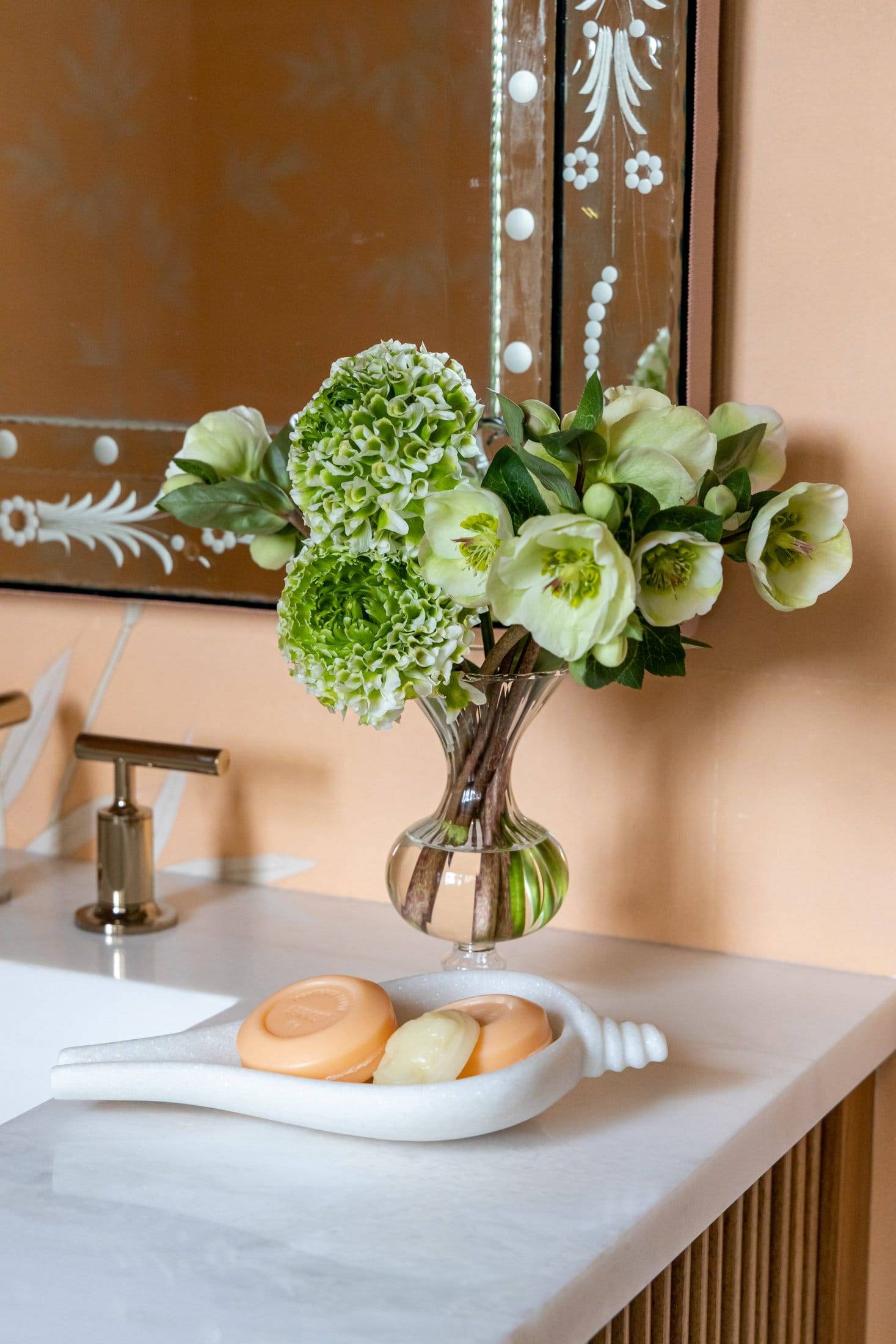
A: One of the reasons I wanted to do that was because I really wanted the sink to not be a major design element. I wanted the marble to be the main design element on the surface. And I really felt like with just the movement of the wallpaper, that introducing a sink would be maybe a bit too busy.
A: One of the reasons I wanted to do that was because I really wanted the sink to not be a major design element. I wanted the marble to be the main design element on the surface. And I really felt like with just the movement of the wallpaper, that introducing a sink would be maybe a bit too busy.


